Monday, December 14, 2009
Wednesday, December 2, 2009
The history of Panopticism

My design teaches the audience though the facts i gathered about panopticism, and it engages the audience because it is visiually enticing. I always consider the rule of thirds entirely when making my design, so i put my emphisis which is "panopticism" in the top left third, and all my panopticons in the bottom thirds of the deisgn. The eye inside the "panopticism" is used as balance, and the quote in red is my contrast. My flow and repetition is conveyed through my constant use of the panopticon, for the bullets, the background, and to fill up the negative space at the bottom of the design. I wanted to keep my design as simple as possible, so i only used color in the quote from Michael Focault.
Monday, November 16, 2009
Wednesday, October 28, 2009

My course catalogue engages the audience because I took a more funny, satirical route. I used rule of thirds to create emphisis. The BCC logo is in the top left third, “this is your college” was placed in the bottom 3 thirds. I lined the course catalogue up to run parallel with the tree to create alignment. My clouds serve as flor and repetition. The big tree also creates some balance between the BCC logo. I used a light blue as the whole background, and left the trees and clouds the color of the paper so it would look like it was scrapbooked onto the page.
Sunday, September 27, 2009

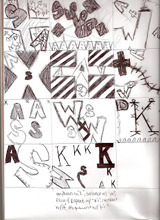
For this project, I went with a more abstract state of mind. Usually with anything I do, I try to take a minimalist and simple approach to get my point across. For this, I used Palatino, courier new, and Georgia fonts. I used the Georgia in italic to contrast the style of the rest of the fonts. I chose to use courier new because of its type writer style. I used Palatino because it is simple and was easy to make shapes out of my letters with. The counter forms I chose to focus on in my project were rectangles, ovals, and triangles. For the emphasis of the project, I used the big “K” in the top left third of the paper. I used the box with the 4 “A”s piled on each other to balance out the K, and to create the flow I used a paintbrush to create a literal flow through the project, starting with my focal point and going around to the rest of the piece. To convey contrast I used one italic font as I stated before, and I also used either very big bold fonts, or small normal ones. To suggest alignment, I kept everything upright just about, so all of the letters that were significant to the piece were aligned with eachother.
Wednesday, September 9, 2009
Subscribe to:
Posts (Atom)


