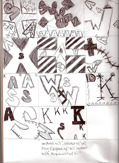
For this project, I went with a more abstract state of mind. Usually with anything I do, I try to take a minimalist and simple approach to get my point across. For this, I used Palatino, courier new, and Georgia fonts. I used the Georgia in italic to contrast the style of the rest of the fonts. I chose to use courier new because of its type writer style. I used Palatino because it is simple and was easy to make shapes out of my letters with. The counter forms I chose to focus on in my project were rectangles, ovals, and triangles. For the emphasis of the project, I used the big “K” in the top left third of the paper. I used the box with the 4 “A”s piled on each other to balance out the K, and to create the flow I used a paintbrush to create a literal flow through the project, starting with my focal point and going around to the rest of the piece. To convey contrast I used one italic font as I stated before, and I also used either very big bold fonts, or small normal ones. To suggest alignment, I kept everything upright just about, so all of the letters that were significant to the piece were aligned with eachother.


